For a SaaS homepage, the first screen is only the beginning of the click-through path. The harder work starts below it: deciding when to send a visitor to free signup, when to send them to help content, and when to route them to contact.
This article does not repeat the Search Console workflow or the contact-page playbook. It focuses on link placement after the first screen: navigation, contextual links, anchor text, section CTAs, footer links, and the role split between /register, help, and /contact.
The short answer: separate signup, understanding, and human help
- Keep the primary CTA pointed at
/register, with copy that names the first action after signup - Use help links where the visitor needs setup, workflow, or usage clarity
- Keep
/contactfor human-handled questions such as procurement, billing, security, legal, or implementation discussion - Treat navigation as a stable map, body links as contextual decisions, and the footer as a backup path
- Write anchor text that explains what the visitor can decide on the destination page
Homepage internal linking is not about adding more links. It is about helping each visitor choose the next page that matches their current intent.
Visitors split into three broad routes after the first screen
Once visitors understand the basic product promise, they do not all need the same next step. The three broad routes are self-serve signup, deeper understanding, and human help. Within those routes, some visitors need source guidance or comparison content before they can choose.
| Visitor state | What they need next | Best destination | Homepage role |
|---|---|---|---|
| Ready to try | what happens after signup | /register |
primary path |
| Needs usage clarity | dashboard, setup, first job | help | support path |
| Needs source or instruction clarity | what to monitor and how to write the request | help and practical blog content | decision support |
| Needs internal approval | procurement, billing, legal, security | /contact |
human conversation |
| Still comparing | use cases, workflows, alternatives | blog | continued evaluation |
If every visitor is pushed to signup, people who need setup clarity may bounce. If every visitor is pushed to contact, self-serve evaluators feel blocked. The homepage should let those routes coexist without giving them the same job.
Navigation should carry only stable roles
Global navigation is the map that stays available while the visitor reads. If it carries every article, campaign, and support route, the main path becomes harder to see.
| Nav item | Role | Avoid |
|---|---|---|
| Product or Features | explain what the SaaS does | listing abstract feature names only |
| Use cases or Blog | show practical operating context | sending visitors to an undifferentiated article list |
| Help | answer setup and usage questions | making it look like the sales support route |
| Contact | handle questions that need a person | absorbing all uncertainty |
| Sign up free | capture people ready to try | competing visually with every other action |
For Stratum Flow, help links should lead naturally to pages such as Dashboard Overview and Basic Settings, How to Write Effective Research Instructions, and Seed URLs: Usage and Examples. Those are not the same as a contact route.
Place body links where the next question appears
Below the first screen, each section should answer one question and then hand off the next one. Internal links work best when they appear where the reader starts needing that next decision.
| Homepage section | Likely next question | Useful link |
|---|---|---|
| Core use cases | How does recurring competitor research actually work? | 5 Ways to Automate Competitive Research |
| First-job explanation | What should I do after signup? | First-Job Onboarding Guide After Free Signup |
| Research instruction section | How should I write a useful request? | How to Write Effective Research Instructions |
| Source selection section | Which pages should I monitor? | Seed URLs: Usage and Examples |
| Business evaluation section | Can I ask about billing, legal, or security? | /contact |
The decision rule is simple: if the homepage would become too detailed, let another page own the detail. Help owns operation. Blog owns workflow context. Contact owns human review.
Anchor text should name the decision
Weak anchor text hides the reason to click. A visitor should understand what the next page will help them decide before they leave the homepage.
| Weak anchor text | Better anchor text | Destination |
|---|---|---|
| Learn more | Review the dashboard and basic settings | /en/help/getting-started |
| See how it works | Learn how to write a research instruction | /en/help/research-instructions |
| Related article | See what to do after free signup | /en/blog/first-job-onboarding-guide-2026 |
| Contact us | Ask about billing, legal, or security review | /contact |
| Get started | Sign up free and create the first recurring research job | /register |
Anchor text is not only an SEO detail. It is part of the product decision path. The wording should tell the visitor why that destination is the right next step.
CTAs should change role by placement
Homepage CTAs do not all need the same copy. The destination can stay focused on /register, while the reason to click changes by section.
| Placement | CTA role | Example copy | Destination |
|---|---|---|---|
| Below the first screen | show the primary path | Sign up free and create your first job | /register |
| After a use-case section | turn a use case into action | Create a competitor research job | /register |
| Near help links | reduce setup uncertainty first | Review setup, then start free | help and /register |
| After security or billing copy | separate human-needed questions | Ask about billing, legal, or security | /contact |
| Near the page end | recover the primary action | Sign up free and start recurring research | /register |
The goal is not to add more buttons. The goal is to keep the roles distinct. Signup starts self-serve evaluation. Help reduces uncertainty. Contact handles questions that require a person.
The footer is for re-exploration, not the main path
The footer is useful for visitors who have reached the end and want to re-orient. It should not carry the burden of the whole internal-link strategy.
| Footer group | Links to include | Role |
|---|---|---|
| Product | features, use cases, API | continue product understanding |
| Resources | blog, help, templates | continue learning and comparison |
| Start | free signup, getting started | prepare to try |
| Company | contact, security, legal | support business review |
Putting a link in the footer does not replace a contextual body link. The body should route the active question. The footer should help visitors recover if they reach the end without choosing a path.
Implementation checklist
- Keep the first primary CTA pointed at
/register - Add one sentence near the first CTA that explains the first post-signup action
- Link to help only where setup or usage clarity is needed
- Link to blog content where the visitor needs a practical workflow example
- Send only procurement, billing, security, legal, and sales questions to
/contact - Keep navigation stable and limited to durable page roles
- Use the footer as a categorized backup path, not the main conversion design
- Rewrite every generic anchor so it explains the decision the destination supports
The checklist is not about link volume. It is about whether each link has a job and appears where the visitor needs it.
Common pitfalls
1. Treating help and contact as the same uncertainty path
Usage and setup questions usually belong in help. Procurement, billing, legal, and security questions usually belong in contact. Mixing them makes contact noisier and help less useful.
2. Reusing "try it free" for every CTA
The same destination can still need different context. After a use-case section, name the job the visitor can create. After a setup explanation, name what they can confirm before signup.
3. Assuming footer links solve internal linking
The footer is a backup. If the body does not provide contextual links, many visitors will make the decision before they ever reach the footer.
4. Making the homepage explain everything
More copy is not always more clarity. Keep operational details in help, workflow examples in blog content, and human review in contact.
When Stratum Flow fits well
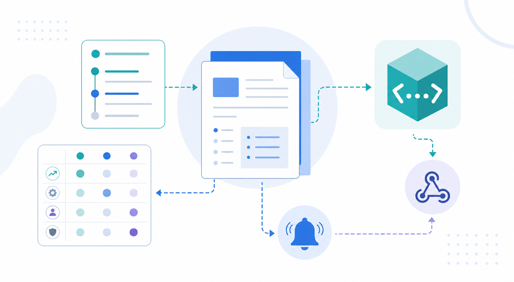
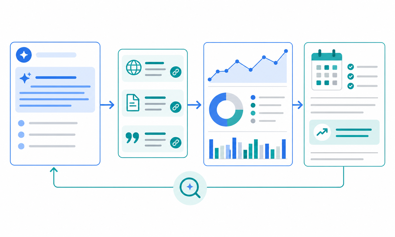
After you redesign your own homepage links, the next useful question is how competitors are changing theirs. SaaS teams adjust navigation, CTA copy, help links, and contact routing over time.
With Stratum Flow, you can pin competitor homepages, help pages, pricing pages, and contact pages as Seed URLs, then review link and CTA changes on a schedule. Combining Seed URLs: Usage and Examples with How to Write Effective Research Instructions makes it easier to track navigation labels, section CTAs, and footer links with the same criteria each week.
Summary
After the first screen, SaaS homepage links should divide three routes: signup, understanding, and human help. Keep /register as the self-serve path, use help for setup and usage uncertainty, and reserve /contact for questions that require a person.
Homepage linking is role design, not link accumulation. Navigation, body links, CTAs, and footer groups should each carry a different part of the visitor's decision path.
Next step
Audit every link below the first screen of your homepage and label it as /register, help, /contact, or blog. If you also want to monitor competitor homepage routing over time, use Stratum Flow to fix the target pages and run recurring research.
Sign up free and start monitoring homepage routing